Vintage board game fonts are distinctive typefaces characterized by bold, readable designs and decorative elements that shaped the visual style of classic games and continue to inspire modern design projects.
Have you ever noticed how vintage board game fonts carry a unique charm that takes you straight back to the past? These typographies aren’t just letters; they tell stories of an era when games sparked imagination through every detail. Curious about what makes them so special? Let’s dive in.
the origins of vintage board game fonts
The origins of vintage board game fonts trace back to the early 20th century, when printing technology was evolving and graphic design was becoming an important part of product appeal. Early board games relied heavily on hand-drawn typefaces, designed to catch the eye and complement the playful nature of the games. These fonts were often bold, simple, and easy to read, reflecting the limitations of printing presses and the need for clear communication.
During the 1930s to 1950s, fonts began to develop more character. Influenced by advertising styles and popular culture, designers created typefaces with unique flair—adding serifs, curves, and decorative elements that gave each game its own identity. This period saw fonts inspired by Art Deco and mid-century modern aesthetics, combining elegance with fun.
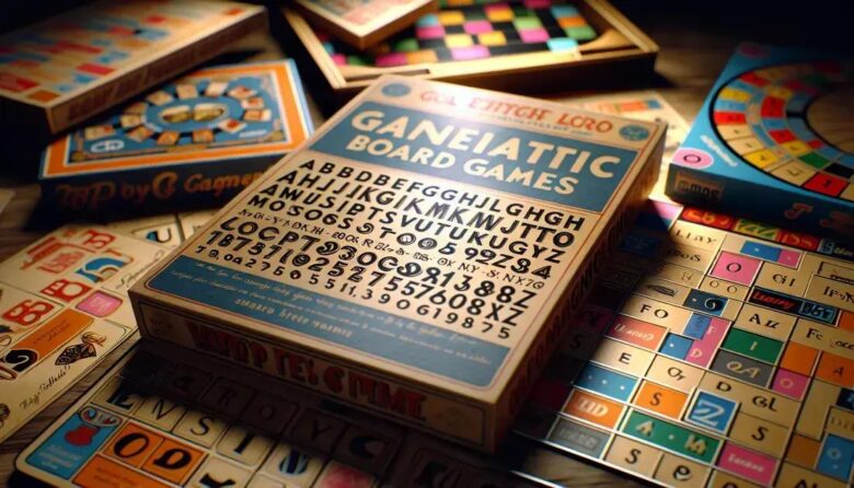
Many of these vintage fonts were custom-made for specific games, helping to build brand recognition. For instance, the lettering on classic games like Monopoly and Scrabble became iconic, showing how typography played a key role in the player’s experience. The combination of graphic innovation and practical design shaped the visual language of board games for decades.
As printing methods improved, so did the complexity of fonts used in board games. Designers experimented with various styles to reflect the game’s theme and story, creating a strong connection between text and gameplay. These origins demonstrate how vintage board game fonts are more than just letters—they are a vital piece of gaming history and culture.
key characteristics of classic game typography
Classic game typography is defined by a set of key characteristics that make vintage board game fonts stand out. One of the most important features is readability. Fonts were designed to be clear and legible from a distance, ensuring players could easily read game instructions and text on the board.
Another characteristic is boldness. Many vintage fonts have thick strokes and strong lines, making the text pop against colorful backgrounds. This bold design helped capture attention and conveyed excitement, perfectly matching the playful nature of board games.
Decorative elements also played a crucial role. From playful curves to subtle serifs and unique embellishments, these features added personality and charm to each font. Such details often reflected the theme of the game, whether it was a whimsical children’s game or a strategic adult game.
Color and Contrast
Classic typography often used high contrast between the font color and the background. This contrast improved visibility and enhanced the overall aesthetic. Designers chose colors that complemented the artwork, contributing to a cohesive game design.
Spacing and alignment were carefully considered as well. Letters and words were spaced to improve flow and make reading easier, while alignment helped guide the player’s eye across the board.
Together, these characteristics make classic game typography instantly recognizable and timeless. They show how thoughtful font design can elevate the game experience beyond just words on a page.
influential fonts that shaped the era
Several influential fonts greatly impacted the look and feel of vintage board games, becoming symbols of their era. Fonts like Cooper Black, Futura, and Gill Sans were widely used for their distinct styles and readability. Cooper Black, with its chunky, rounded letters, brought a friendly and approachable vibe to many games.
Futura stood out with its clean, geometric shapes, adding a modern and futuristic touch to game typography. It was often selected to evoke progress and innovation. Gill Sans offered a more classic and elegant script, with simple and balanced strokes that made text attractive yet easy to read.
Custom Fonts and Hand Lettering
Many board games also featured custom fonts or hand-lettered titles. Designers created bespoke typefaces tailored to the game’s theme, helping it stand apart on the shelves. This bespoke typography contributed to the unique identity of each game and enhanced the brand’s recognition.
These influential fonts reflected broader design trends of their time, connecting board games with popular culture, advertising, and graphic arts. Their styles continue to inspire designers today, showing how strong typography shapes visual storytelling.
Understanding these fonts helps us appreciate how typography played a crucial role in the golden age of board games and why vintage styles are still loved by collectors and designers alike.
how vintage fonts impact game design today

Vintage fonts have a strong influence on game design today, especially in the world of board games and digital recreations. Designers often use these fonts to evoke nostalgia and create an authentic feel that connects players to the rich history of classic games. This connection helps players feel more engaged and immersed in the gameplay.
Modern game designers incorporate vintage typography to add character and charm. Whether in retro-style games or new board games aiming for a timeless look, these fonts provide a visual link to the past. They help communicate the theme and mood of the game, enhancing storytelling and overall experience.
Blending Old and New
Many games mix vintage fonts with contemporary design elements. This blend creates a fresh yet familiar visual style that appeals to both older fans and new audiences. Digital game interfaces also use vintage-inspired fonts to mimic the feel of classic physical games.
Using vintage fonts can also influence branding and marketing. They bring a sense of trust and tradition, attracting players who appreciate the game’s heritage.
Overall, vintage fonts are more than a design choice; they are a tool that connects decades of gaming culture, helping to build memorable and meaningful experiences for today’s players.
tips for choosing vintage fonts for modern projects
Choosing the right vintage fonts for modern projects can add unique style and personality. Start by considering the project’s theme and target audience. Vintage fonts vary widely—some are playful and bold, while others are elegant and refined. Selecting a font that matches your project’s mood is crucial.
Look for fonts with good readability. Even vintage fonts should be easy to read, especially for longer texts. Avoid overly decorative styles that may distract or confuse readers.
Pairing Vintage Fonts
Combine vintage fonts with clean, modern typefaces. This balance keeps your design fresh and prevents it from looking outdated. Use vintage fonts for headlines or accents, and simpler fonts for body text.
Check the font’s versatility. A good vintage font should work well in different sizes and weights. Testing the font in various contexts ensures it suits your project’s needs.
Lastly, respect licensing rules. Some vintage fonts may require a license for commercial use. Make sure to review and comply with these requirements to avoid legal issues.
By thoughtfully selecting and pairing vintage fonts, you can create designs that blend nostalgia with modern appeal, capturing attention and enhancing the user experience.
preserving vintage typography in digital formats
Preserving vintage typography in digital formats is essential to keep classic design styles alive and accessible in modern times. Many vintage fonts were originally created by hand or with printing techniques that do not directly translate to digital media. To preserve them, designers digitize these fonts, carefully capturing the unique details and imperfections that give them character.
High-quality scanning and vectorization are vital steps in this process. Scanning original printed materials or hand-drawn letters provides a base image, which designers convert into scalable vector fonts. This maintains sharpness and allows the font to be resized without losing quality.
Restoration and Cleaning
During digitization, restoration is often necessary. Designers remove noise, fix gaps, and smooth edges while preserving the original style. This balance ensures the font remains authentic but usable for modern design software.
Digital archives and font libraries play a crucial role in preserving vintage typography. They store digitized fonts and make them available for creative projects, education, and historical research.
By preserving vintage typography digitally, we protect an important piece of design history and provide valuable resources for contemporary designers who want to add nostalgic charm to their work.
inspiration from vintage fonts beyond board games
Vintage fonts inspire much more than just board games. Their unique styles influence graphic design, advertising, packaging, and even digital media. These fonts carry a nostalgic feel that evokes feelings of warmth and familiarity, making them popular choices in various creative fields.
In branding and marketing, vintage fonts help convey authenticity and a sense of heritage. Many companies use them to create logos or packaging that stand out on shelves and appeal to customers’ love for retro aesthetics.
Fashion and Lifestyle
Vintage typography is also widely used in fashion and lifestyle industries. Clothing brands and shops incorporate these fonts in their designs to tap into retro trends, making products feel timeless and stylish.
In digital design, vintage fonts add charm to websites, apps, and social media content. Designers carefully blend these fonts with modern elements to create fresh and engaging visuals that catch attention.
Beyond commercial uses, vintage typography inspires art projects and DIY creations. From posters to personalized gifts, these fonts bring a creative touch that connects past and present.
Overall, the influence of vintage fonts extends far beyond board games, proving their lasting impact and versatility in design today.
Bringing vintage fonts into today’s design
Vintage board game fonts are more than just old styles—they tell stories and create strong connections with the past. By understanding their history and key features, designers can use them effectively in modern projects.
Whether for branding, digital media, or creative art, vintage fonts add character and charm that resonates with many. Preserving and adapting these fonts keeps the spirit of classic design alive, while inspiring new ideas and styles.
Exploring vintage typography opens up many creative possibilities, making it a valuable tool for designers who want to blend nostalgia with fresh design.