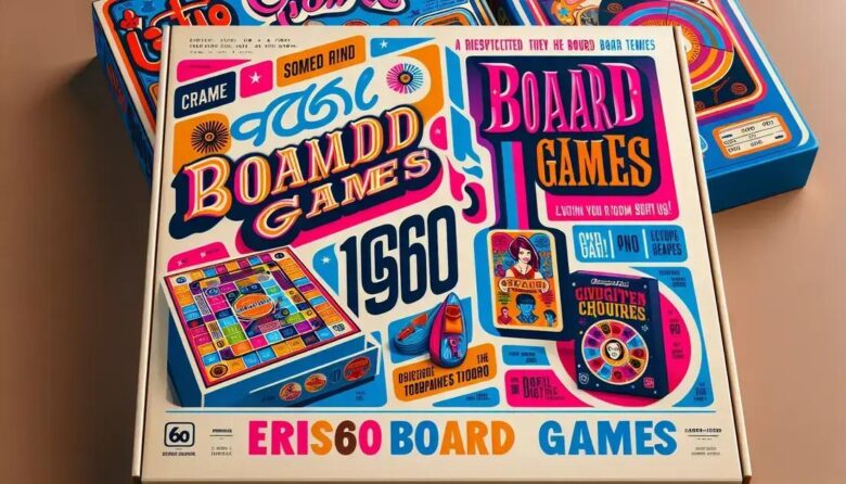
Board game graphic design in the 1960s used bold colors, playful typography, and inspired illustrations rooted in pop culture and modern printing techniques, shaping visually engaging games that continue to influence modern board game aesthetics and player experience.
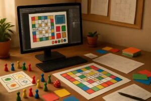
Board game graphic design in the 1960s wasn’t just about making pretty boxes. Ever noticed how those vintage games pull you in with their colors and fonts? There’s a story behind those visuals that still influences game design today.
main graphic design styles of the 1960s and their impact on board games
The 1960s was a decade of bold experimentation in graphic design, and these trends deeply influenced board game aesthetics. Key styles included psychedelic art, characterized by swirling patterns and vibrant colors, which brought a sense of excitement and imagination to game boxes. Modernism, with its clean lines and geometric shapes, introduced simplicity and clarity to game layouts, making games more approachable. The use of pop art elements, inspired by advertising and mass media, added playful and eye-catching visuals that appealed to a broad audience.
Designers of the time used these styles to create a visual identity for board games that was both trendy and engaging. The combination of bold color palettes and experimental typography not only attracted players but also reflected the cultural shifts happening in that era. This fusion helped games stand out on store shelves and communicate their themes effectively.
How 1960s Styles Enhanced Game Appeal
By embracing the era’s graphic design movements, board games gained a distinctive look that connected with both children and adults. Psychedelic patterns stimulated creativity and curiosity, modernist layouts improved usability, and pop art’s irony and humor increased the entertainment value. Together, these styles turned board games into visual statements as much as sources of fun.
how color choices influenced player engagement
Color choices played a crucial role in 1960s board game graphic design by directly influencing player engagement and emotional response. Designers used bright and contrasting colors to capture attention on crowded store shelves, making games more appealing to both children and adults. Warm colors like red, yellow, and orange conveyed excitement and energy, encouraging players to pick up the game and join in the fun.
Cool colors such as blue and green were used to create a sense of calm and strategy, fitting for games that required thoughtful play. Color contrast between game elements helped players differentiate between teams, pieces, or board areas, improving gameplay clarity. This visual guidance allowed players to focus more on the game rather than deciphering confusing graphics.
Psychological impact of color in games
Psychology studies show that colors can affect mood and behavior, and 1960s designers tapped into this by aligning their palettes with the game’s theme. For example, bright primary colors were common in family-friendly games to evoke happiness and inclusivity. Meanwhile, darker tones were used for competitive or adult-targeted games to suggest seriousness and depth.
Ultimately, the thoughtful use of colors enhanced the overall player experience, making games not only visually striking but also more intuitive and engaging. Effective color design remains a key factor in board game popularity to this day.
typography trends in 1960s board game design
Typography in 1960s board game design was marked by bold experimentation and a desire to capture attention quickly. Designers often used large, sans-serif fonts that were easy to read and conveyed a modern, playful feel. These fonts reflected the optimism and forward-thinking spirit of the decade.
Another common trend was the use of hand-drawn lettering or playful typefaces that added personality and charm to games. This style helped communicate the game’s theme or mood, whether it was whimsical, adventurous, or mysterious.
Impact of typography on player experience
Typography was more than just decoration; it guided players during gameplay. Clear and distinct lettering helped players quickly understand game instructions and identify key game elements. Contrasting font sizes and styles were used to highlight important information, such as the game’s title or scoring rules.
Decorative typefaces were also popular for box art and promotional materials, reinforcing the visual identity of the game. The mix of clean and creative typography made 1960s board games visually engaging and accessible, encouraging more players to explore and enjoy the games.
role of illustration and imagery in classic board games

Illustrations and imagery played a vital role in classic 1960s board games by setting the tone and sparking imagination. Many games featured hand-drawn artwork that brought themes and stories to life, helping players visualize the game world before even opening the box. From whimsical characters to detailed scenes, the artwork invited players into new adventures.
Imagery was also used strategically to convey rules and gameplay elements in an intuitive way. Icons, symbols, and illustrative maps helped players understand complex ideas without needing lengthy instructions. This visual language made games more accessible and enjoyable for all ages.
Impact of artwork style on player attraction
The style of illustrations often matched the game’s theme, whether it was fantasy, mystery, or education. Bright, colorful drawings invited younger players, while more realistic or sophisticated art appealed to older audiences. The artwork served as a first impression, creating excitement and encouraging players to explore the game further.
Memorable illustrations from the 1960s continue to inspire modern board game art, showing how powerful visuals are in creating lasting player connections and enhancing the overall gaming experience.
influence of pop culture and advertising aesthetics
Pop culture and advertising aesthetics had a strong influence on 1960s board game graphic design. Game designers drew inspiration from popular movies, television shows, and comic books, incorporating familiar characters and themes to attract players. This strategy connected games to the broader cultural trends of the time, making them more relatable and enticing.
Advertising techniques also informed the design, with eye-catching visuals intended to grab attention on crowded shelves. Bold headlines, vibrant colors, and dynamic layouts mirrored the styles used in print ads and packaging, aiming to create an immediate emotional impact.
Using pop culture to build excitement
Many board games featured artwork and typography that echoed popular advertising campaigns, blending entertainment with marketing. This approach helped establish games as desirable products by tapping into nostalgia and the excitement surrounding current trends.
The integration of pop culture and advertising aesthetics not only boosted sales but also influenced the way people perceived board games, transforming them into cultural icons.
materials and printing techniques shaping graphic elements
The materials and printing techniques of the 1960s significantly shaped the graphic elements of board games. Most game boxes and boards were printed on thick cardboard, which allowed for vibrant colors and detailed images to stand out. The lithography printing process was commonly used, enabling sharp lines and rich hues that made artwork pop and attracted buyers’ attention.
Advances in printing technology also made it easier to produce multi-colored designs, which designers used to create eye-catching patterns and intricate illustrations. The texture and quality of materials, such as matte or glossy finishes, further enhanced the visual appeal and durability of the graphic elements.
Effect on design creativity and player experience
These materials and techniques gave designers more freedom to experiment with bold visuals and complex layouts. The tactile feel of heavy cardboard and smooth finishes added to the overall player experience, making games feel substantial and valuable.
Printing limitations sometimes influenced design choices, too, such as simplifying artwork to reduce costs, which ultimately contributed to the iconic, clean aesthetic of many classic 1960s board games.
how 1960s design trends are inspiring modern board games
Many modern board games draw direct inspiration from the bold and playful design trends of the 1960s. Contemporary designers often incorporate vibrant colors, geometric shapes, and retro typography to evoke nostalgia while appealing to today’s audiences. This blend of vintage style with modern sensibilities creates a unique look that honors the past yet feels fresh.
Additionally, the use of hand-drawn illustrations and thematic imagery popularized in the 1960s has made a comeback, adding charm and personality to new games. Design elements such as clear iconography and intuitive layouts from that era also continue to influence how games communicate rules and gameplay visually.
Balancing classic style with innovation
Modern games balance retro aesthetics with updated printing techniques and materials, allowing for higher quality graphics and durability. This fusion enhances the player experience by combining familiar, beloved design cues with contemporary precision and creativity.
Ultimately, the enduring appeal of 1960s board game design proves its power to inspire and shape the evolving world of modern tabletop gaming.
Reflecting on the impact of 1960s graphic design on board games
The graphic design trends of the 1960s have left a lasting mark on board games, blending bold colors, playful typography, and engaging illustrations to create memorable experiences.
Today, modern games continue to draw inspiration from these classic styles, combining vintage charm with new technologies to captivate players of all ages.
This ongoing influence highlights how powerful design can be in shaping not just game aesthetics, but also the way players connect with and enjoy their favorite games.
Embracing these design legacies helps keep the spirit of the 1960s alive while pushing board game creativity forward.