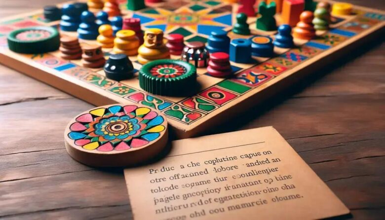
Board game color theory uses strategic color choices to influence player emotions, guide behavior, and enhance gameplay in vintage designs despite printing and material limitations.
Board game color theory is more than just choosing pretty shades—it’s about how colors subtly steer your feelings and choices. Ever wonder why some vintage games feel so captivating? Let’s unpack the color secrets behind those timeless designs.
the basics of color theory in board games
Color theory in board games is about understanding how colors interact and influence player perception. It involves concepts like color harmony, contrast, and the emotional impact colors evoke. Designers use this knowledge to guide players’ attention and create an engaging atmosphere.
Primary Colors and Their Effects
Primary colors—red, blue, and yellow—are often used as the basis for palettes. Red can evoke excitement or urgency, blue tends to calm and promote trust, while yellow feels energetic and cheerful. These colors can set the overall tone of a game.
Color Harmony and Balance
Using complementary or analogous colors helps keep the board visually appealing without overwhelming the player. Effective color harmony ensures key elements stand out, like player pieces or important cards, making gameplay smoother and more intuitive.
Contrast and Readability
Good contrast between background and foreground colors improves readability of text and symbols. Designers often use light colors on dark backgrounds or vice versa to highlight vital game information, reducing player frustration.
Emotional and Psychological Impact
Colors can subtly influence mood and decision-making. Warm colors might encourage aggressive play, while cool tones can promote thoughtful strategy. Understanding these effects helps create a more immersive experience.
historical overview of vintage board game colors
Vintage board games often used color palettes that reflected the materials and printing techniques available at the time. Early games relied on simple, bold colors due to limited ink options and printing costs. These choices gave games a distinct, recognizable style.
Early 20th Century Color Trends
During the early 1900s, colors like red, black, and cream were common. These hues were practical and easy to print. Games such as Monopoly and Clue used these shades to balance clarity with manufacturing limitations.
The Mid-Century Shift
After World War II, advances in printing allowed for brighter and more varied colors. Designers embraced pastels and primary colors to make games more visually appealing. This era saw a rise in playful palettes that attracted children and families.
Impact of Cultural Movements
The 1960s and 1970s introduced psychedelic and bold colors influenced by broader art and cultural trends. Games began incorporating experimental designs and vibrant colors to stand out on shelves.
Preservation and Restoration
Today, collectors and designers study vintage color schemes to restore classic games or inspire new designs that evoke nostalgia. Understanding past color use helps capture the original mood and player experience.
psychological effects of specific colors in game design
Colors in board games can trigger different feelings and reactions in players. Understanding these psychological effects helps designers craft experiences that match the game’s mood and purpose.
The Power of Red
Red is known for creating excitement and urgency. It can increase heart rate and draw attention, making it useful for action or competitive games. However, too much red can feel aggressive or stressful.
Calming Influence of Blue
Blue tends to evoke calmness and trust. Games using blue may encourage careful thinking or cooperation. It’s often chosen for strategy games where players need to feel focused and relaxed.
Cheerfulness of Yellow
Yellow brings energy and optimism. It catches the eye quickly, making it great for highlight spots on the board or important cards. But in large amounts, yellow can cause anxiety or fatigue.
Green and Balance
Green represents growth and harmony. It is easy on the eyes and can promote a balanced, peaceful play environment. Green often appears in games with nature themes or cooperative goals.
Black and Authority
Black can communicate power and sophistication but may also feel intimidating. Its use in game design is often minimal and strategic, emphasizing critical elements or creating contrast.
Designers combine these colors carefully to influence player mood and gameplay style, enhancing immersion and enjoyment.
how color influences player behavior and decision making

Colors in board games can guide players’ choices and affect how they behave during gameplay. Designers use color cues to direct attention, signal importance, and influence emotions that shape decision making.
Guiding Player Attention
Bright colors like red or yellow naturally draw the eye. By highlighting key elements such as special cards or action spaces, these colors help players know where to focus, speeding up gameplay and reducing confusion.
Creating Emotional Responses
Colors can evoke feelings that influence risk-taking or cooperation. For example, warm colors may encourage aggressive strategies or fast moves, while cool colors can promote calm and thoughtful decisions.
Signaling Game States
Color changes indicate progress or danger. A red token might warn of a penalty, while green might show safety or reward. These visual signals help players adapt their strategies in real time.
Enhancing Memory and Recognition
Consistent use of colors for particular roles or actions aids memory. Players quickly learn to associate colors with effects, reducing cognitive load and increasing engagement.
Overall, color is a subtle but powerful tool shaping how players interpret the game world and make choices.
case studies of iconic vintage board games
Iconic vintage board games showcase how thoughtful color theory shapes player experience. These games used color strategically to communicate rules, create atmosphere, and enhance gameplay.
Monopoly
Monopoly uses a classic color palette with distinct hues like red for houses and green for money. This clear use of color helps players easily recognize game elements and maintain focus during long play sessions.
Clue
In Clue, colors identify characters and rooms. Each player’s token color matches their character card, making it simple to track progress. The muted tones of the board create a mysterious mood fitting the game’s detective theme.
Risk
Risk uses bold, contrasting colors on its world map to define territories. This clarity aids players in strategic planning and territorial control, while the vibrant reds and blues add excitement to the conquest theme.
Scrabble
Scrabble’s pastel colors highlight special board spaces like double or triple word scores. The soft color scheme keeps the board easy on the eyes, encouraging thoughtful word play without visual fatigue.
These case studies reveal how vintage board game designers mastered color choices to balance aesthetics and functionality, influencing player engagement and game success.
practical tips for applying color theory today
Applying color theory in modern board game design starts with understanding the emotional and functional role colors play. Here are practical tips to help designers use color effectively.
Choose a Clear Palette
Limit your color palette to a few key colors to keep the design simple and focused. Using contrasting colors helps important game elements stand out and improves player readability.
Consider Accessibility
Account for players with color vision deficiencies by using patterns or symbols in addition to colors. Tools like color blindness simulators can help ensure your design is inclusive and clear for everyone.
Match Colors to Game Mood
Select colors that fit your game’s theme and emotions. Bright, warm colors work well for fast-paced or competitive games, while cool and muted tones suit strategic or cooperative games.
Use Color Consistently
Assign specific colors to roles, actions, or statuses and keep them consistent throughout the game. This helps players quickly learn and remember the rules and reduces confusion.
Test and Iterate
Playtest your game focusing on how colors guide players and affect their experience. Be ready to adjust your palette based on feedback to achieve the best balance between aesthetics and functionality.
challenges and limitations in vintage color use
Vintage board game designers faced several challenges when using color due to technology and material limits. These constraints influenced how colors were chosen and applied, affecting the overall game design.
Limited Printing Techniques
Early printing methods restricted the range of colors available. Designers often had to work with a limited palette of basic, flat colors, which affected the complexity and vibrancy of the visuals.
Color Consistency Issues
Inconsistent ink quality and printing processes sometimes led to variations in color from batch to batch. This made it difficult to maintain a uniform look across all copies of a game.
Material Constraints
The type of cardboard and paper used influenced how colors appeared. Some surfaces absorbed ink unevenly, dulling colors or causing bleeding, which could reduce clarity and appeal.
Cost Limitations
Adding more colors increased printing costs, so designers had to balance aesthetics with budget. This often meant fewer colors or simpler graphics to keep games affordable.
Color Fading Over Time
Many vintage colors faded due to exposure to light and wear, changing the original look of the game and sometimes making it harder to play or enjoy.
Despite these challenges, vintage game designers used creative solutions to maximize the impact of limited color options and produce memorable gameplay experiences.
The lasting impact of color in vintage board game design
Color played a vital role in shaping player experiences in vintage board games. Despite the challenges of limited palettes and printing methods, designers created memorable games that captured emotions and guided play.
Understanding these color choices helps us appreciate the thoughtful craft behind classic games and offers valuable lessons for today’s designers. By blending psychology and creativity, color remains a powerful tool to engage players and bring games to life.